
A Brief Overview of the Importance of Good Website Design
A well-designed website is a powerful tool that significantly enhances user experience, boosts your brand’s online visibility, and drives business growth. Implementing website design best practices is essential for ensuring that your site is not only visually appealing but also user-friendly and optimized to create conversions.
Introduction to RedShift Digital Marketing and Their Expertise in Website Design
RedShift understands that a great website is more than just stunning visuals. It’s about creating a seamless user experience that guides visitors from one page to another, effortlessly leading them down the conversion funnel. With a data-driven approach and a keen understanding of industry trends and standards, our team excels at designing websites that are not only aesthetically pleasing but also effective in driving business growth.
Understanding Your Target Audience
Importance of Knowing Your Audience in Website Design
Every successful website design starts with a deep understanding of the target audience. Just as a skilled chef knows the preferences of his frequent diners, a web designer must be intimately familiar with the needs, desires, and behaviors of the website’s users.
Why? Because the best website designs are the ones that resonate with their audience, satisfying their needs and exceeding their expectations.
Knowing your audience in website design means more than just identifying demographics like age and location. It’s about understanding their goals, interests, and challenges. It’s about knowing what motivates them to visit your site, what they hope to achieve, and what might drive them away. This kind of in-depth understanding informs every aspect of website design, from the layout and navigation to the color palette and typography.
How RedShift Digital Marketing Uses Data-Driven Approach to Understand Audience
At RedShift Digital Marketing, we believe in making data-driven decisions. Our approach to understanding your audience begins with a thorough audience analysis, which explores the demographics and psychographics of your target market.
Moreover, we don’t stop at understanding your audience. We also analyze your competitors to see how they position their brand and what kind of content generates more engagement. This holistic, data-driven approach allows us to craft a website and additional content that is not only visually appealing but also deeply resonates with your target audience.
By focusing on understanding your audience, we ensure that your website is not just a beautiful digital space, but a strategic tool that attracts, engages, and converts your target market. After all, the goal isn’t just to design a website—it’s to design a website that works for your business.
Branding and Aesthetics
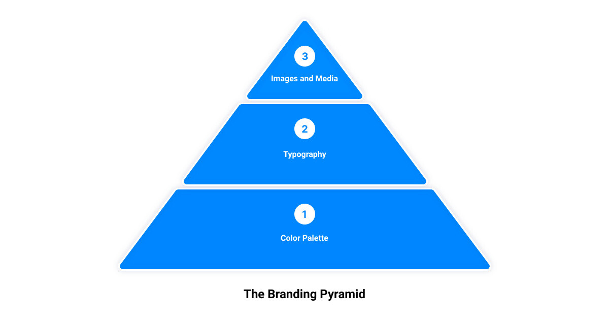
Let’s dive into the heart of your website’s design, where your brand identity takes center stage. This is where the strategic use of color, typography, and visuals come together to create a cohesive and engaging aesthetic that truly reflects your brand.
Building a Color Palette that Reflects Your Brand
Color is more than just a decorative element; it’s a powerful communication tool that significantly influences a visitor’s perception of your brand. According to a study, brands that consistently use the same colors across their marketing materials can improve brand recognition by up to 80%.
Start by exploring color theory to understand the associations specific colors may have. Then, decide on a color palette by selecting a primary color that will make up 60% of your site, a secondary color for 30%, and an accent color for the final 10%.
These colors should either contrast or complement each other to improve readability and accessibility. For instance, on a long-scrolling site, using complementary colors like yellow and purple can help distinguish different sections.
Choosing the Right Typography for Your Website
Typography is another crucial aspect of your website design that significantly impacts user experience and accessibility. It includes font style, size, appearance, and structure.
Stick to two visually compatible yet distinguishable font styles for consistency. Use web-safe fonts to ensure that they render as intended across different browsers and devices. Set your text to a minimum size of 16 pixels or 12 pt for optimal readability. Keep your lines to 50-75 characters to avoid causing eye fatigue for your readers.
The Role of Images and Media in Enhancing Aesthetics
Images and other media elements can draw attention and linger in the minds of your site visitors. Therefore, it’s important to be consistent and intentional in your choices.
Incorporate high-quality static images, gifs, videos, and other media elements that enhance the overall aesthetic of your site and support your brand message. For example, if you’re a fitness brand, images of people working out or achieving their fitness goals can reinforce your brand’s promise of personalized training with results.
In summary, the strategic use of color, typography, and visuals can create a cohesive and engaging aesthetic that not only looks good but also enhances user experience and communicates your brand identity effectively. This is where RedShift Digital Marketing’s expertise in website design can truly shine, ensuring your website isn’t just visually appealing but strategically designed to work for your business.
Simplicity and Minimalistic Design
A cluttered web design can be overwhelming and confusing for your users. To create a website that truly serves its purpose and keeps users engaged, simplicity and a minimalistic design play a crucial role.
Why Less is More in Web Design
A simple design is not just aesthetically pleasing, it’s functional. The goal of your website is to help your users complete an action or find specific information. When your design is simple and uncluttered, it makes it easier for users to focus on what they’re looking for. This means fewer distractions and a smoother user experience.
Moreover, simple designs load faster. With research indicating that 40% of users abandon a site that takes more than three seconds to load, it’s clear that page-loading speed is a factor you can’t afford to ignore. Importantly, a simple and clean design contributes to a quicker load time, enhancing your website’s performance and user satisfaction.
How to Achieve a Clean and Simple Design
Achieving a clean and simple design involves stripping away unnecessary elements and focusing only on those that serve a functional purpose. This doesn’t mean your website has to be bare or boring. It’s about creating a balance between design and functionality.
Color usage should be kept to a minimum. The Handbook of Computer-Human Interaction recommends using a maximum of five different colors in your design. This helps to maintain visual consistency and avoid overwhelming the user with too many hues.
Typography also plays a role. Choose typefaces that are easy to read and limit your selection to a maximum of three different typefaces in three different sizes. Legibility is key to ensure that your content can be easily consumed by your users.
Graphics should be used where they make sense on your site. Very often, people will get overwhelmed by large blocks of text. To keep your site content interesting, it is important to deploy images in a way that flows with your written content. Of course, it is possible to use too many images, so you want to make sure that every image you use on your site aligns with your brand and leads your audience to convert.
A simple and minimalistic design can significantly enhance the usability and user experience of your website. As your expert guide in website design, RedShift Digital Marketing will help you strike the perfect balance between aesthetics and functionality, ensuring your website not just looks good, but also delivers results.
Visual Hierarchy and Organization
A visually appealing website can make a powerful first impression, but to truly hook your audience and guide them through their journey, understanding the concept of visual hierarchy is crucial. It’s like a roadmap that subtly directs your visitors’ eyes to the information they need while also highlighting key elements of your brand or message.
Understanding the Concept of Visual Hierarchy
Visual hierarchy in web design refers to the arrangement and presentation of elements in a way that implies importance. It’s the difference between a chaotic page where everything screams for attention and a structured page where information unfolds naturally.
By strategically arranging design elements, you can guide visitors to the most vital parts of your website.
There are several factors to consider when creating a clear visual hierarchy, starting with balance. Balance in web design is how visual elements are distributed on a page. Think of it as a scale—If you have a visually heavy item on one side, balance it with an equally heavy item on the other side. This can be achieved using symmetrical, asymmetrical, or mosaic design layouts.
Composition, or the organization of website elements, is another critical factor. A popular framework for this is the rule of thirds, which provides guidelines for aligning text and arranging elements.
Lastly, the scale can be used to bring attention to vital details. Small, medium, and large sizes can give you variety while maintaining a clear website hierarchy. Enlarging important elements will help them stand out.
Best Practices for Organizing Website Elements
Organizing your website elements effectively can significantly improve the user experience. Here are some best practices for achieving this:
Follow the F and Z patterns: Depending on the content type, users generally follow the letters F and Z to scan content. Designing your page layout according to these patterns can enhance the flow of information and improve the user experience.
Use whitespace strategically: Whitespace, or negative space, gives elements room to breathe and helps reduce cognitive overload, making your content more digestible.
Group related elements together: This helps users process information faster and improves the page’s readability and scannability.
Utilize textures and visuals: These add depth to your design and draw attention to specific, conversion creating elements.
Ensure consistent use of colors and fonts: Consistency in design elements can make your website look professional and trustworthy.
At RedShift Digital Marketing, we implement these practices to create websites that are not only visually appealing but also effective in conveying your brand’s message and driving conversions.

Navigability and User Experience
As we delve deeper into the best practices of website design, we encounter the crucial aspect of navigability and user experience. Both are key factors in retaining visitors and encouraging them to take desired actions on your site.
Planning Intuitive Navigation for Better User Experience
Imagine being in a large supermarket for the first time. Without clear signage and aisle labels, finding what you need could turn into a frustrating scavenger hunt. The same principle applies to your website. Navigability is about planning an intuitive, easy-to-follow roadmap for your visitors. This includes keeping the structure of your primary navigation simple and near the top of your page, and incorporating navigational cues in the footer of your site.
One effective navigational tool is the use of breadcrumbs on every page (except your homepage), allowing users to trace their navigation trail. Also, consider including a search bar near the top of your site so visitors can search by keywords. It’s essential not to overwhelm users with too many navigation options per page. Remember, simplicity is key here!
Lastly, avoid making users dig too deep to find what they’re looking for. A basic wireframe map of all your site pages arranged like a pyramid can help: Your homepage sits at the top, and each linked page from the previous forms the next layer. As a rule of thumb, it’s best to keep your map no more than three levels deep.
Strategic Placement of CTAs and Buttons
The strategic placement of Call-to-Action (CTA) buttons is another vital aspect of navigability and user experience. CTAs guide your visitors towards the desired action, whether it’s signing up for a newsletter, making a purchase, or downloading a resource.
Each CTA should be clear, easy to find, and use straightforward language. Pop-ups can be effective, but they can also frustrate users.
Using heat maps can help understand user behavior and determine the most strategic spots for CTAs based on where engagement is highest on the page.
At RedShift Digital Marketing, we understand that effective navigability and well-placed CTAs are crucial to a website’s success. Our expert team designs websites with these principles in mind, ensuring a seamless user experience that drives conversions.
Consistency in Design Elements
Have you ever walked into a room where every piece of furniture was from a different decade? Although each piece might be beautiful on its own, the overall effect can be disorienting. The same principle applies to web design. A consistent design doesn’t just make your website aesthetically pleasing, but it also helps guide your visitors through their journey on your site with ease.
The Importance of Consistency in Web Design
Consistency is the key to a successful user interface. It means ensuring every element on your website—from fonts to colors to layout—follows a uniform style and pattern. It decreases the learning curve for your visitors, making it easier for them to navigate and interact with your website.
Moreover, a consistent design also reflects professionalism and builds trust. A website that appears haphazard or inconsistent can create a sense of unease or mistrust among visitors. In contrast, when a website is consistent in its design elements, it communicates reliability and credibility, which is crucial for fostering trust with your audience.
Tips for Maintaining Consistency Across Your Website
Achieving consistency in web design doesn’t have to be challenging. Here are a few tips:
1. Stick to a Color Palette: Choose a color scheme that reflects your brand and stick to it across your website. This not only enhances visual consistency but also strengthens your branding.
2. Use Consistent Typography: Your choice of fonts should be the same or similar across all your web pages. Avoid using too many fonts as it can make your website look cluttered and unprofessional.
3. Maintain a Standard Layout: Keep the layout of your pages consistent. This includes the placement of your logo, navigation menu, headers, and footers. This predictability allows users to navigate your site effortlessly.
4. Use Uniform Images and Media: Ensure your visuals follow a similar style and quality. This includes images, videos, and other media forms. They should complement each other and your overall design aesthetic.
5. Consistent Messaging: Beyond visuals, make sure your messaging is consistent. This includes your tone of voice, language, and the overall message you’re communicating.
At RedShift Digital Marketing, we believe that consistency is the secret ingredient to a successful website design. Our design process ensures a consistent and unified look across your entire website, resulting in a cohesive brand identity and improved user experience. Our goal is not just to make your website look good, but to ensure it works effectively for both you and your users.
Responsiveness and Mobile-First Approach
The digital landscape is ever-changing, and your website needs to evolve with it. Today, more than just being a static billboard, your website must be a dynamic, interactive experience that caters to the needs of your users wherever they are and on whatever device they are using. This is where the concepts of responsiveness and mobile-first approach come into play.
Why Your Website Must Be Responsive
Imagine walking into a store only to find that the aisles are too narrow for you to walk through, or the shelves are too high for you to reach the products. Frustrating, right? The same applies to your website when it’s not responsive. A responsive website design ensures that your website looks and works perfectly on all devices, from desktops to smartphones.
In fact, according to Statista, 48% of global page views were from mobile devices. And our research shows that a whopping 93% of people have left a website because it didn’t display properly on their device.
This underlines the importance of a responsive design. On a responsive website, content is automatically resized and reshuffled to fit the dimensions of the device a visitor is using. This can be done using mobile-friendly HTML templates or by creating a dedicated mobile site.
The bottom line is, your website must be responsive to give a great user experience. It should be compatible with the many different devices your visitors are using, ensuring the user experience is seamless, regardless of the device used to access your website.
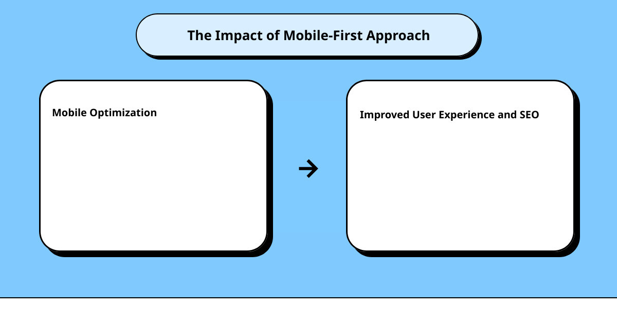
The Benefits of a Mobile-First Approach in Web Design
The term “mobile-first” is more than just a buzzword. It’s a critical strategy for modern web design. The reason is simple: most of the internet traffic today comes from mobile phones. Google even uses a mobile-first indexer, essentially putting mobile at the front and center of its indexing and ranking systems.
So, what are the benefits of a mobile-first approach? Firstly, it prioritizes the largest segment of your audience. With more people using their mobile devices to browse the internet, a mobile-first approach ensures you’re meeting your audience where they are. Secondly, it improves your SEO. Google rewards websites that are optimized for mobile with better search rankings, leading to more organic traffic.
Finally, a mobile-first approach forces you to focus on what’s essential. Mobile screens are smaller, which means you can’t clutter them with unnecessary elements. This leads to a cleaner, more streamlined design that’s focused on delivering the best user experience.
Above all, remember that a mobile-first approach does not mean ignoring the desktop version of your website. Instead, it’s about designing for smaller screens first and then scaling up for larger screens. Your website should still look and function great on all devices – desktop, tablet, and mobile.
In a nutshell, a responsive, mobile-first approach is no longer an option in today’s digital world; it’s a necessity. By implementing these strategies, you can ensure your website offers an optimal user experience, no matter what device your visitors use to access your site.
Accessibility and SEO
The Role of Accessibility in User Experience and SEO
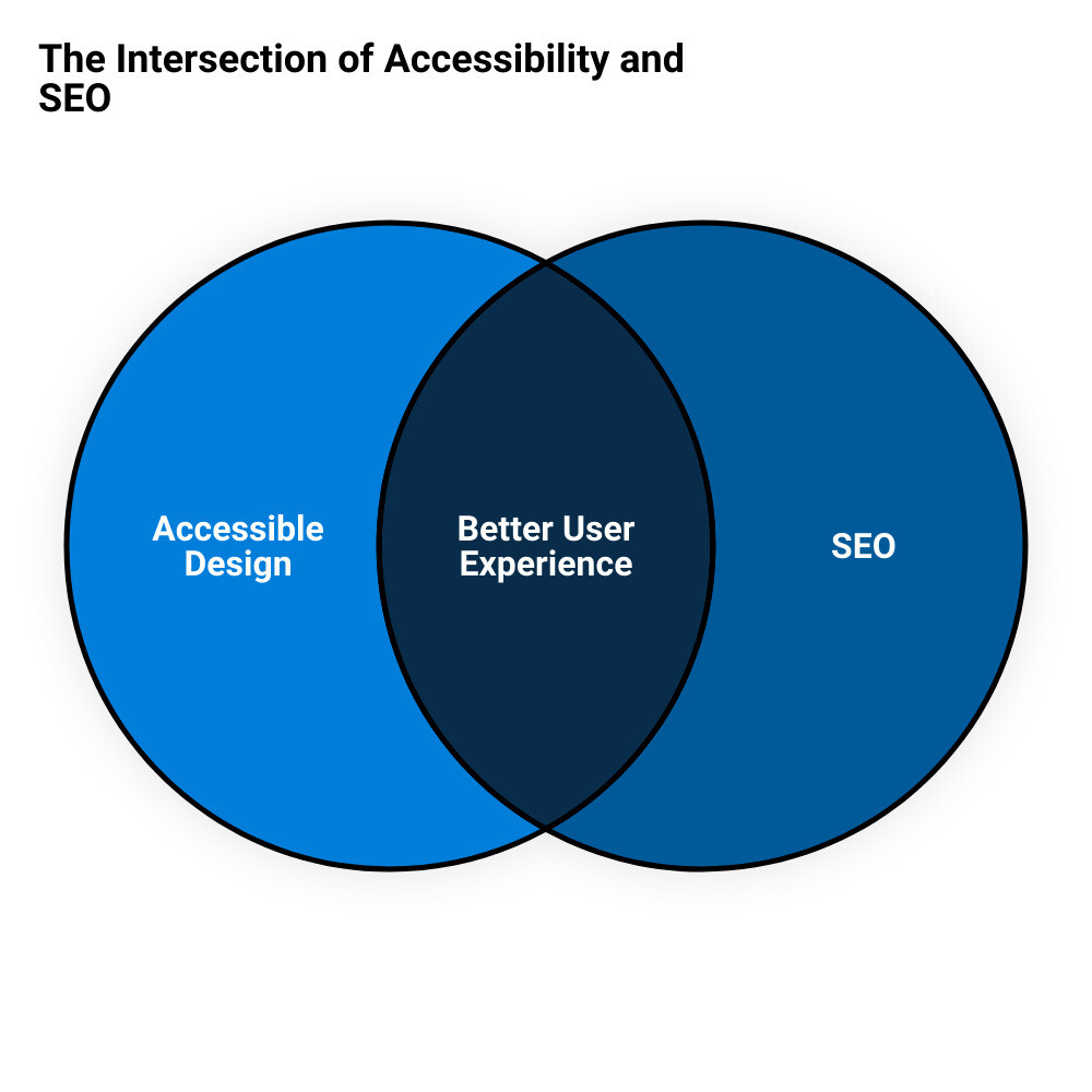
As we explore deeper into the essentials of top-notch website design, let’s shine a spotlight on a factor that’s often overlooked yet critical for enhancing user experience and SEO: accessibility. As a trusted ally in your digital marketing journey, RedShift Digital Marketing emphasizes the importance of making your website accessible to all users, including those with disabilities or limitations that might affect their browsing experience.
When we talk about accessibility, we mean more than just meeting legal requirements. We’re referring to the creation of an inclusive digital space, ensuring everyone, regardless of their abilities, can interact freely with your website. Not only does this align with the principles of fairness and equality, but it also significantly impacts your SEO.
How exactly does accessibility influence SEO? The answer is simple: Google and other search engines prioritize websites that provide a user-friendly experience for all. This means that if your website adheres to the Web Content Accessibility Guidelines (WCAG), it stands a higher chance of ranking well in search results.
Indeed, the WCAG guidelines echo some of the key principles of SEO. For example, ensuring your website is understandable involves using clear, concise language and alt text for images. Similarly, making your site operable for different users requires a well-structured, easy-to-navigate design.
How to Design a Website for Accessibility
Now that we’ve established the importance of accessibility, the question becomes—how can you design your website to be more accessible? Here are some practical tips RedShift Digital Marketing recommends to make your website user-friendly for all:
Ensure your website is understandable: This involves making your site’s content identifiable to all users. Use alt text for images, provide transcripts or captions for video content, and use a clear, legible font for text.
Confirm your website is operable: This means ensuring all navigation and interactive features of your website can be accessed and used by everyone. For instance, all functionality should be available via a keyboard for those who can’t use a mouse.
Keep your content understandable: All text, instructions, and alerts on your site should be written in simple, straightforward language. Avoid jargon or complex terms that might confuse users.
Test your website for accessibility: Use online tools to check your site for accessibility issues and address them promptly.
Remember, an accessible website isn’t just about compliance; it’s about providing a seamless experience for all users. And as an added bonus, it can significantly boost your SEO efforts. So, if you’re looking to improve your online presence and make your website more user-friendly, accessibility should be high on your list of priorities.
Credibility and User-Centricity
With millions of websites available at a finger’s tap, credibility has become the cornerstone of an effective user experience. But how does one establish trust in the digital realm? The answer lies in clear and honest communication coupled with a user-centric approach.
Building Credibility Through Clear and Honest Communication
One of the fastest ways to lose a potential customer is through a lack of transparency. Your website is the digital face of your business, and as such, it needs to accurately reflect what you offer in a straightforward manner. Be clear about your products or services, pricing, and what sets you apart from the competition.
If you’re selling a product, don’t bury the details deep within your site. Instead, be upfront about its features, cost, and benefits.
If you’re providing a service, make sure visitors can easily understand what you do and how you can help them. Don’t force visitors to dig through multiple pages to find this information. Instead, present it clearly on your homepage.
Adding a dedicated pricing page linked from the homepage can also significantly boost credibility. Not only does this make your business appear more transparent, but it also saves visitors’ time and effort in finding this crucial information.
Prioritizing User Needs and Preferences Through User Testing
Creating a website without considering user needs and preferences is like shooting arrows in the dark. That’s where user testing comes in. By conducting user testing, you can gather valuable feedback and insights into how real users interact with your site, what they like, and what areas need improvement.
Remember, you are not your user. So, it’s essential to test your website with individuals who represent your target audience. They will provide unbiased feedback and catch potential issues you may have overlooked.
There are several user testing tools available that can offer invaluable insights. For instance, Crazy Egg provides heat map and scroll map intelligence, while Loop11 allows you to create usability tests without needing HTML experience. The key is to choose the tools that best match your testing needs and budget.
Conclusively, to foster credibility and create a user-centric website, it’s crucial to be clear in your communication and prioritize user needs through testing. In doing so, you’ll not only create a more enjoyable user experience but also foster trust and loyalty among your site visitors.
Conclusion
In a digital world, where your website is often the first point of contact for potential customers, it’s vital to offer an online experience that is not only visually appealing but also user-friendly and optimized for search engines. As we’ve explored in this article, there are 10 key website design best practices that can significantly enhance the user experience.
As a recap, these practices include understanding your target audience, maintaining a consistent branding and aesthetics, creating simplicity in design, implementing visual hierarchy, ensuring easy navigability, adopting a mobile-first approach, and prioritizing accessibility and SEO. Furthermore, building credibility through clear communication and prioritizing a user-centric design approach are no less important.
However, we understand that these practices, while effective, may seem daunting to implement. That’s where RedShift Digital Marketing steps in. Our team of experienced professionals understands the intricacies of web design and development. We’re here to help you navigate through these best practices and implement them effectively on your website.
Our team is skilled in creating visually appealing websites that not only reflect your brand but also ensure a user-friendly experience. We consider all aspects of the user journey, from the initial landing on your page to the final conversion point. Furthermore, our experts are well-versed in SEO, ensuring your website gets the visibility it deserves.
At RedShift Digital Marketing, we believe in a holistic approach to digital marketing. We don’t just design websites—we create online experiences that capture, engage, and convert your target audience. So, if you’re ready to take your website to the next level and deliver an exceptional user experience, we’re here to help. Together, we can turn your website into a powerful tool for business growth and success.e
